A plot() function is a generic function that is used to plot points in a graph.
Plot One Point in R
Generally the ordered pair (x,y) represents a point on a graph.
In R, we pass specific points for x-axis and y-axis respectively as a parameter for the plot() function to create a plot. For example,
# create one point at (2,4)
plot(2, 4)
Output
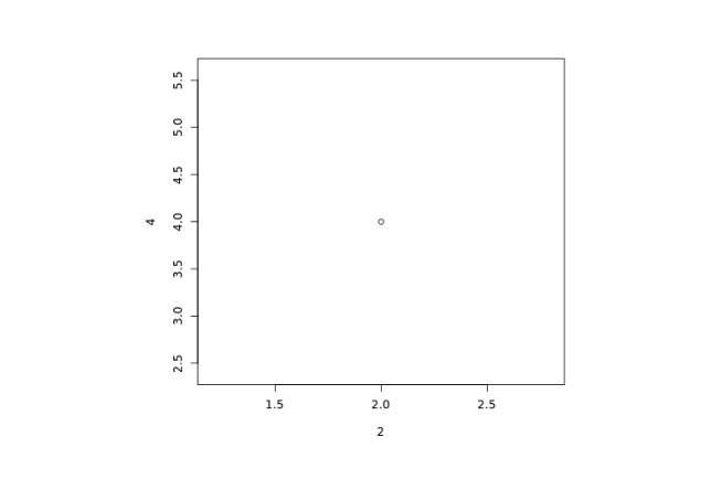
In the above example, we have used the plot() function to plot one point on a graph.
plot(2, 4)
Here,
- 2 - specifies point on the x-axis
- 4 - specifies point on the y-axis
Plot Multiple Points in R
We can also plot multiple points on a graph in R. For that we use the R Vectors. For example,
# create a vector x
x <- c(2, 4, 6, 8)

# create a vector y
y <- c(1, 3, 5, 7)

# plot multiple points
plot(x, y)
Output

In the above example, we can plot multiple points on a graph using the plot() function and R vector.
plot(x, y)
Here, we have passed two vectors: x and y inside plot() to plot multiple points.
The first item of x and y i.e. 2 and 1 respectively plots 1st point on graph and second item of x and y plots 2nd point on graph and so on.
Note: Make sure the number of points on both vectors are the same.
Plot Sequence of Points in R
In R, we use the plot() function and the : operator to draw a sequence of points. For example,
# draw sequence of points
plot(1:5)
Output
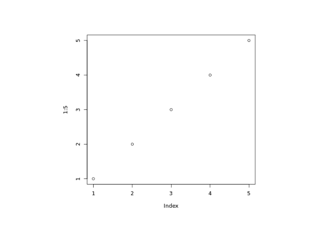
In the above example, we have used the plot() and the : operator to draw a sequence of points.
The plots are drawn in (1, 1), (2, 2), (3, 3), (4, 4), (5, 5) order.
Draw a Line in R
We pass the type parameter inside the plot() function to change the plot type. For example,
# draw a line
plot(1:5, type="l")
Output
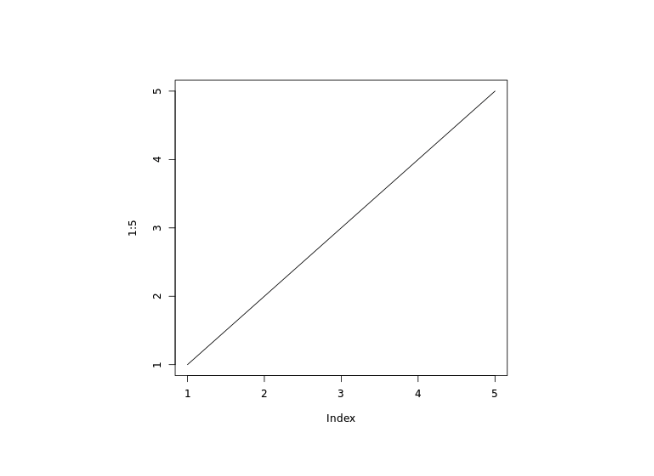
In the above example, we have used the type parameter inside plot() to change the type of plot.
plot(1:5, type = "l")
Here, type = "l" draws a line to connect all the points.
Different Plot Types in R
In R, we can change the type of plot using the type parameter inside the plot() function.
Here are some of the most commonly used types of plot we can use inside plot():
| Value | Description |
|---|---|
| "p" | Points Plot (Default) |
| "l" | Line Plot |
| "b" | Both Line and Points |
| "s" | Step Plot |
| "n" | No Plotting |
| "h" | Histogram-like Plot |
Add Title and Label to a Plot in R
We can add titles, provide labels for the axes of the plot in R. For example,
plot(1:5,
  main="Plot Sequence of Points",
  xlab="x-axis",
  ylab="y-axis")
Output
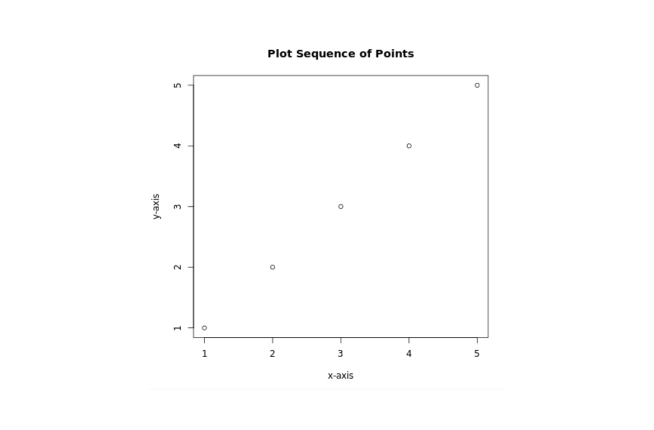
In the above figure, we can see that we have added a title, a label to the x-axis and y-axis.
Here,
main- adds the title"Plot Sequence of Points"xlab- adds the label"x-axis"for x-axisylab- add the label"y-axis"for y-axis
Plot Trigonometric Function in R
In R, we can also plot trigonometric functions.
Let's generate a sine wave plot,
# sequence vector of values from -pi to pi with 0.1 interval
x = seq(-pi,pi,0.1)

# respective sine value of x
y = sin(x)

# plot y against x
plot(x,y)
Output
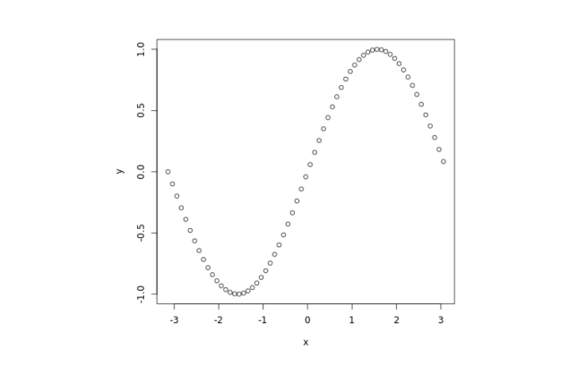
In the above example, we have generated a sine wave plot.
We have used the seq() function to create the sequence vector x of values from -pi to pi with 0.1 interval. And assigned respective sine values of x to y.
Finally, we plotted y against x using plot().
Note: Similarly, we can generate wave plots of other trigonometric functions.